Designing for Decision-Making
From raw data to operational understanding
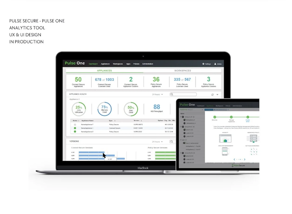
I designed visualization experiences that helped administrators move from a high-level overview into increasingly detailed information.
The experience was structured around three questions:
What is happening? → Where is the problem? → What should I investigate next?
Instead of treating charts as isolated UI components, I designed them as part of an analytical workflow—helping administrators identify patterns, investigate anomalies, and understand activity across their enterprise environment.
Long-Term Impact
Designed in 2016. Still creating value years later.
Pulse Secure
Enterprise Security Analytics & Data Visualization
About Pulse Secure
Pulse Secure was an enterprise cybersecurity company specializing in secure access solutions that helped organizations securely connect employees, devices, and applications across on-premise and cloud environments.
Its enterprise products gave IT and security teams centralized visibility and control over access, users, devices, policies, and security activity. Pulse Secure was later acquired by Ivanti and became part of its enterprise security portfolio.
My Role
Designing data that helps IT administrators make better decisions
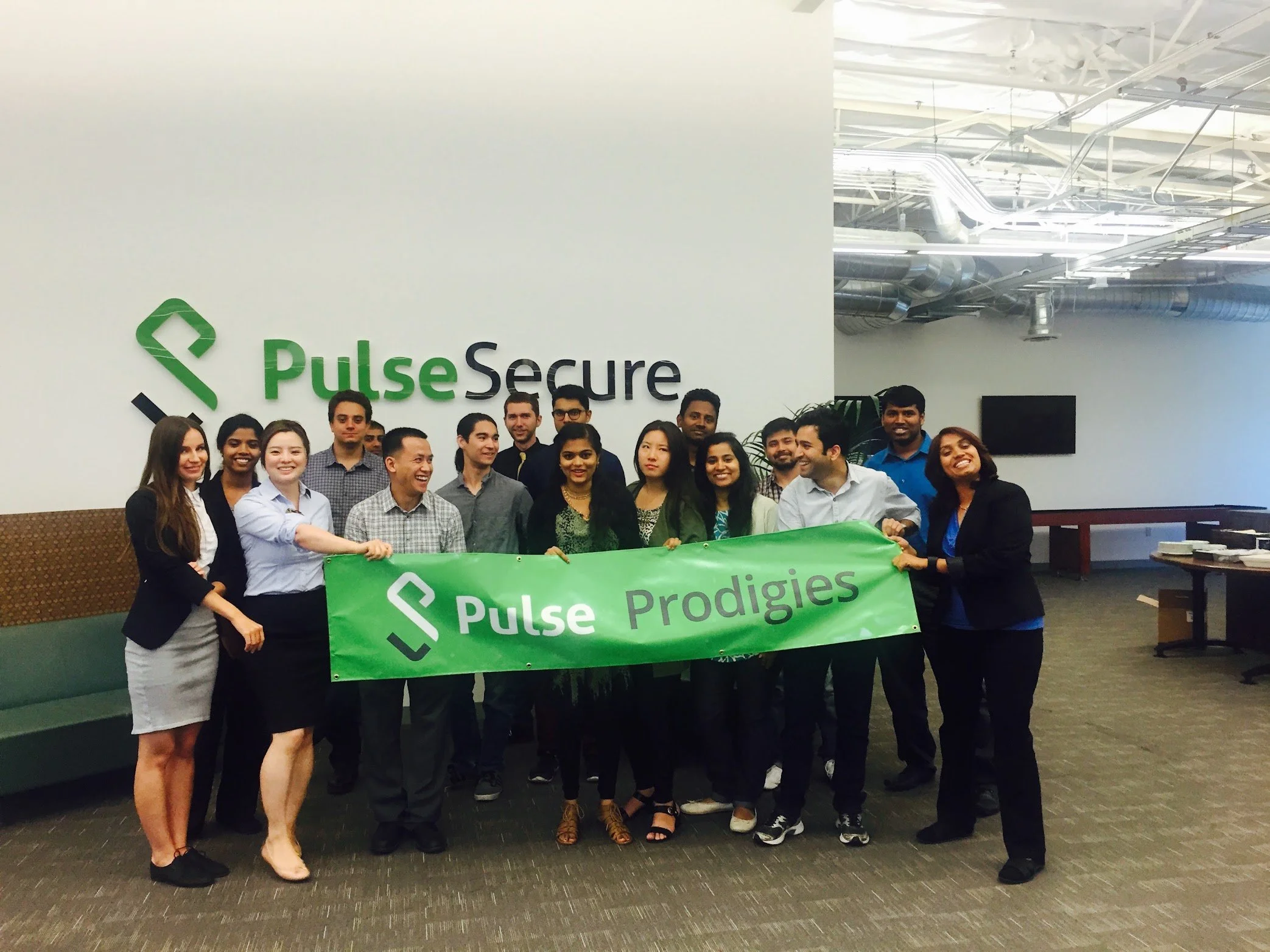
I joined Pulse Secure in 2016 as part of a cohort of approximately 30 interns. I was one of only two interns selected to continue into the extended program, where I had the opportunity to work on a real enterprise product used by IT administrators.
My primary focus was data visualization and enterprise analytics.
Rather than simply presenting large volumes of technical data, my goal was to help IT administrators quickly understand what was happening across their environments, identify meaningful patterns and risks, and make more informed operational and security decisions.
Data Visualization · Enterprise UX · Information Architecture · Dashboard Design · Interaction Design · Data-Driven Decision Support